Crontinel
crontinel.com · Developer
The jury's review
Jury review of Crontinel
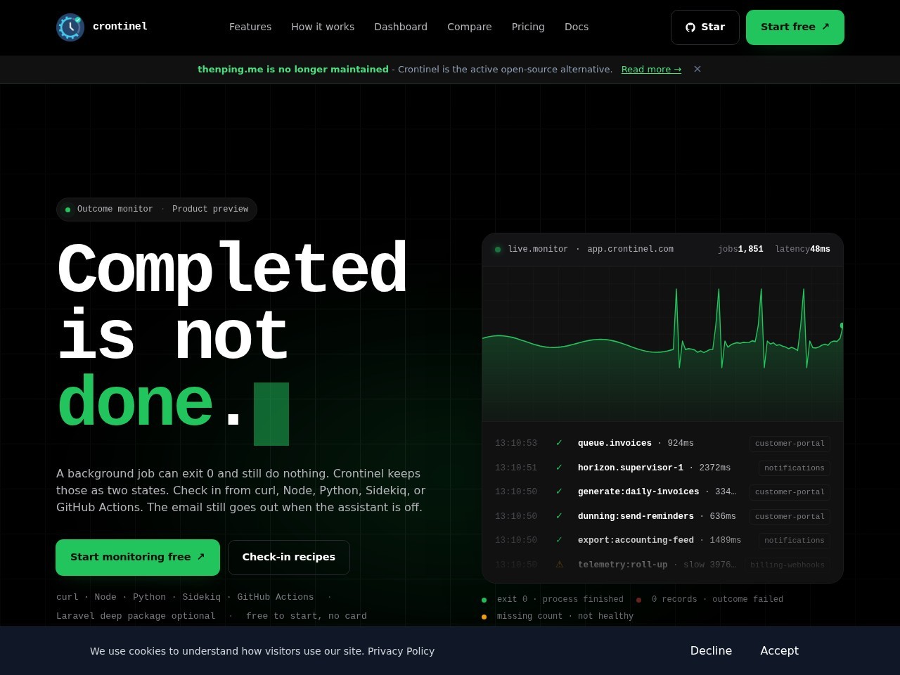
A developer-tool landing page styled like a terminal dashboard, balancing technical specificity with sharp typography and cardiogram-inspired telemetry graphics.
Crontinel frames its value proposition with laser focus: distinguishing between process completion (exit 0) and actual task execution. The visual execution relies heavily on the dark-mode developer aesthetic—subtle grid background, monospace logs, and CRT-like phosphor green accents. The simulated monitor widget on the right effectively reinforces the heartbeat metaphor. While visually confident and cohesive, it treads familiar ground in modern SaaS styling, closely following contemporary design conventions for developer tooling without breaking new structural or interaction boundaries. Semantic structure is solid, though unlabelled buttons and overlay stacking hold it back slightly.
What the jury loved
- Punchy, crystal-clear value proposition conveyed through confident typography.
- Cohesive developer-centric visual metaphor with terminal-style logs and oscilloscope graphs.
- Fast-loading Astro-powered build with structured headings and semantic landmarks.
For the winner
Wear the award.
Add the official badge to your site, case study or press page. It links back to this review — and readers who click through can see exactly why you won.
About the badges →Winner's badge
Add the badge to your site
Copy a snippet and paste it anywhere — it links back to your review.
<a href="https://websitedesignawards.com/site/crontinel" target="_blank" rel="noopener">
  <img src="https://websitedesignawards.com/api/public/badge/c79a5e99-9a3c-4ace-a9cc-426bee848767/svg?variant=dark" alt="Crontinel — Honorable Mention, Website Design Awards" width="240" height="88" loading="lazy" />
</a>[](https://websitedesignawards.com/site/crontinel)