daymark.
zyqor-daymark.vercel.app · Product
The jury's review
Jury review of daymark.
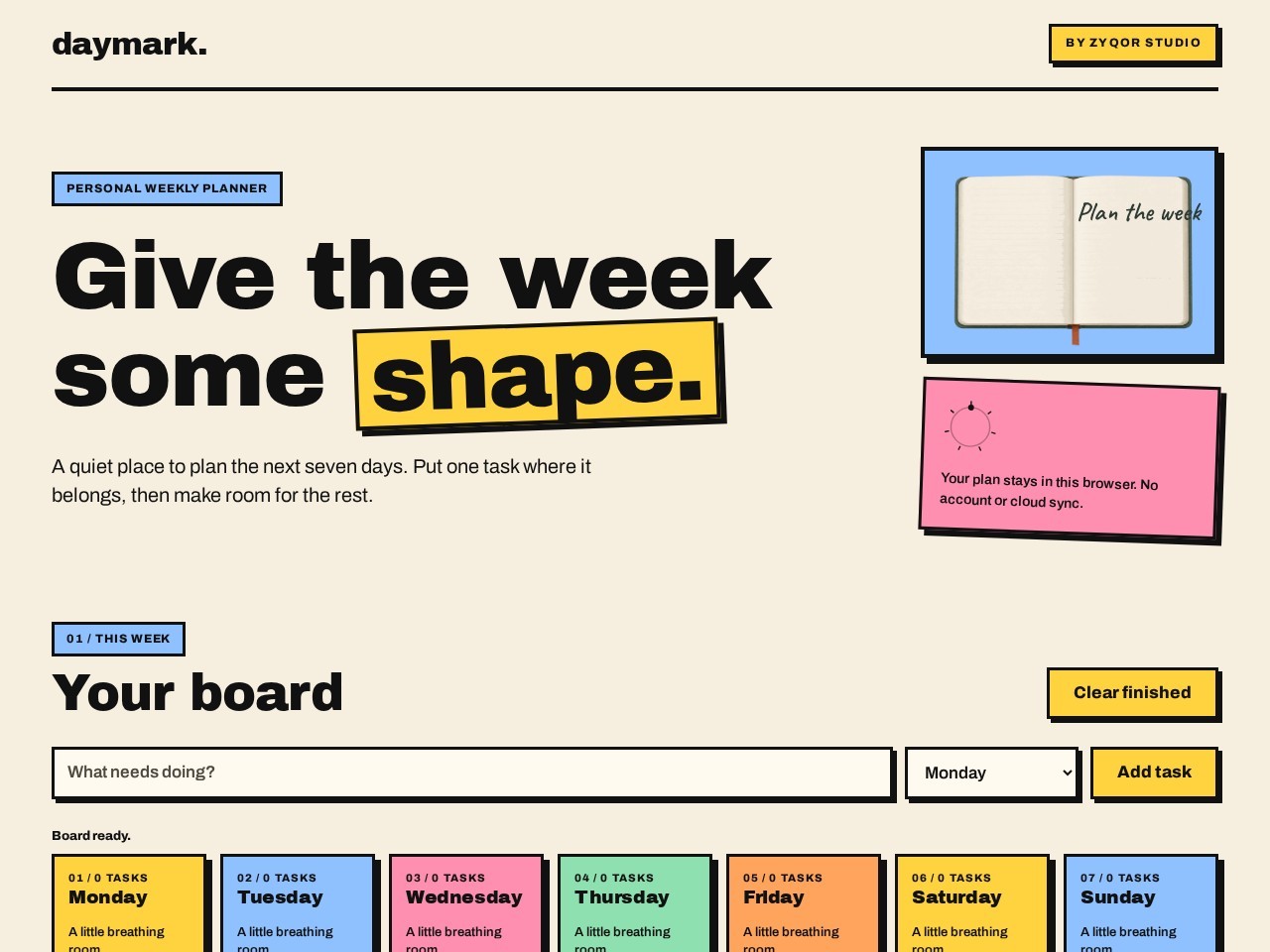
A neo-brutalist local-first weekly planner wrapped in tactile pastel blocks, thick borders, and heavy display typography.
Daymark adopts the trendy neo-brutalist aesthetic—thick strokes, offset shadows, and cheerful pastel color blocks—and applies it effectively to a personal utility tool. The interface makes its value proposition immediately clear: a local-first, distraction-free weekly planner that requires no sign-ups or server persistence. Typography is confident, anchored by Archivo Black and balanced with measured editorial copy. While the visual language borrows from well-trodden design trends rather than breaking new conceptual ground, the craft is disciplined and cleanly executed. It succeeds as an appealing, no-nonsense web tool that delivers utility wrapped in engaging visual personality.
What the jury loved
- Crisp neo-brutalist visual execution with cohesive outlines, shadows, and pastel accents.
- Immediate utility with zero friction or account hurdles, storing state directly in localStorage.
- Strong typographic hierarchy powered by punchy Archivo Black headlines and clear input controls.
For the winner
Wear the award.
Add the official badge to your site, case study or press page. It links back to this review — and readers who click through can see exactly why you won.
About the badges →Winner's badge
Add the badge to your site
Copy a snippet and paste it anywhere — it links back to your review.
<a href="https://websitedesignawards.com/site/daymark" target="_blank" rel="noopener">
  <img src="https://websitedesignawards.com/api/public/badge/fac1202d-7757-4948-92ba-89b5f0c59830/svg?variant=dark" alt="daymark. — Honorable Mention, Website Design Awards" width="240" height="88" loading="lazy" />
</a>[](https://websitedesignawards.com/site/daymark)