DRĄSA
drasa.uk · Agency
The jury's review
Jury review of DRĄSA
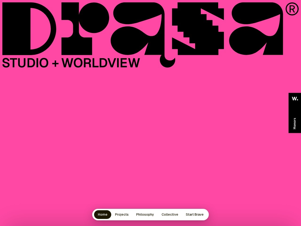
DRĄSA opens with an electric neon-magenta field anchored by massive, custom-lettered brutalist typography and a floating pill navigation.
DRĄSA makes an audacious first impression with an uncompromising flood of hot neon magenta and heavyweight bespoke lettering. The custom logotype commands the viewport, balancing experimental glyph geometry with crisp grotesque titling. Below, a neat floating pill navigation guides visitors across their practice, while the underlying technical build shows solid semantic care with full landmark tagging, structured heading hierarchies, and thorough link labels. While the vast expanse of unmodulated neon color on the first fold risks fatigue and gives little immediate hint of the research and coaching depth underneath, the conviction of the art direction is undeniable and instantly memorable.
What the jury loved
- Striking custom typography full of eccentric, memorable glyph details.
- Unapologetic, high-impact colour direction that stands out immediately.
- Solid semantic structure with proper landmarks and cleanly labelled navigation.
For the winner
Wear the award.
Add the official badge to your site, case study or press page. It links back to this review — and readers who click through can see exactly why you won.
About the badges →Winner's badge
Add the badge to your site
Copy a snippet and paste it anywhere — it links back to your review.
<a href="https://websitedesignawards.com/site/drasa" target="_blank" rel="noopener">
  <img src="https://websitedesignawards.com/api/public/badge/6387ef4b-c41f-4ef1-b035-5a542bdb1225/svg?variant=dark" alt="DRĄSA — Site of the Day, Website Design Awards" width="240" height="88" loading="lazy" />
</a>[](https://websitedesignawards.com/site/drasa)