Hacker Times
hackertimes.ca · Editorial
The jury's review
Jury review of Hacker Times
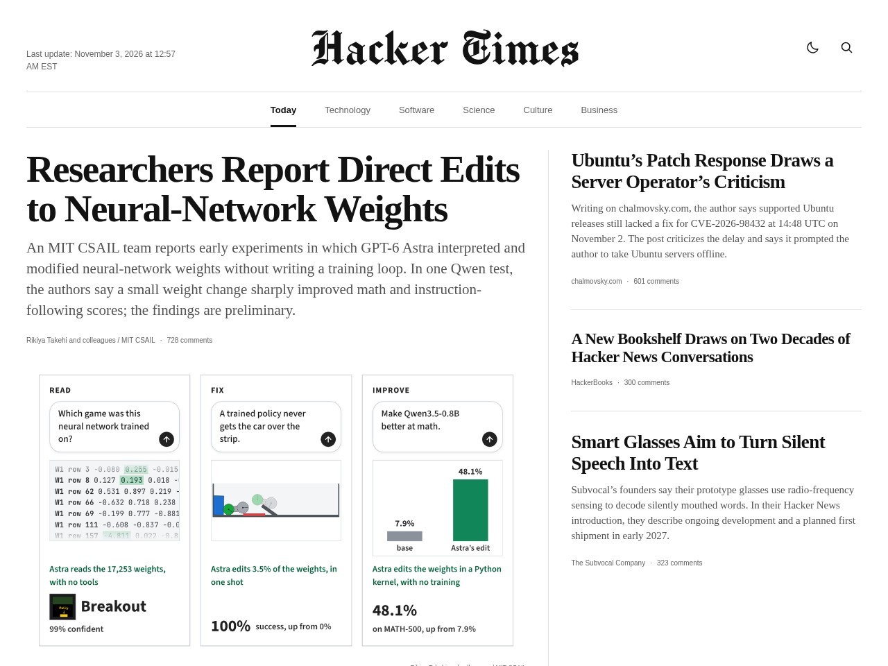
A faithful broadsheet adaptation of Hacker News, rendering tech aggregation with classic New York Times editorial typography and multi-column grid layout.
Hacker Times pulls off a clever stylistic translation: reformatting the chaotic firehose of Hacker News into the dignified, measured architecture of a traditional broadsheet. From the blackletter masthead to the hairline grid rules and considered serif typography, the visual homage to legacy print journalism is rendered with discipline and restraint. Beyond mere parody, the interface genuinely improves readability for top discussions by generating executive summaries and featuring illustrative graphics alongside comment metrics. While it borrows its entire design language from an established institution, the conceptual juxtaposition and execution are clean, legible, and remarkably pleasant to browse.
What the jury loved
- Crisp, disciplined broadsheet typography and multi-column grid layout.
- Clever transformation of raw forum aggregation into structured editorial copy.
- Clean semantic HTML with complete landmark coverage and fully labelled buttons.
- Balanced information density that makes tech news significantly more digestible.
For the winner
Wear the award.
Add the official badge to your site, case study or press page. It links back to this review — and readers who click through can see exactly why you won.
About the badges →Winner's badge
Add the badge to your site
Copy a snippet and paste it anywhere — it links back to your review.
<a href="https://websitedesignawards.com/site/hacker-times" target="_blank" rel="noopener">
  <img src="https://websitedesignawards.com/api/public/badge/4e9b7f1b-a547-471e-a857-ba427166d0e8/svg?variant=dark" alt="Hacker Times — Site of the Day, Website Design Awards" width="240" height="88" loading="lazy" />
</a>[](https://websitedesignawards.com/site/hacker-times)