Hoy
gethoy.app · Product
The jury's review
Jury review of Hoy
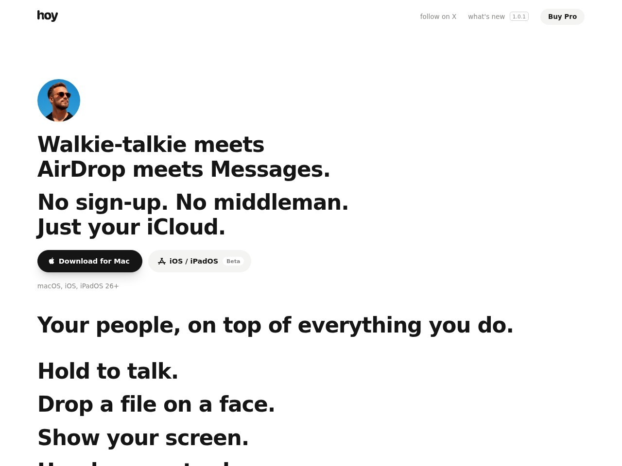
A clean, Apple-native software landing page with stark typographic discipline and interactive scroll-driven product simulations.
Hoy approaches macOS utility marketing with austere, confident minimalism. Eschewing the conventional 3D isometric mockups and hyper-saturated gradients typical of modern software sites, it relies on crisp typographic hierarchy, ample whitespace, and focused, tactile UI elements. The copy is unusually direct, paired with an inventive scroll-driven recreation of the menu bar experience that demonstrates functionality without extraneous noise. The technical foundation is lean, boasting reduced-motion respect and fast initial response times. While the first viewport feels somewhat sparse before the scrolling animation engages, the site succeeds through sheer restraint, craft, and an unwavering Apple-native design sensibility.
What the jury loved
- Stark, confident typographic discipline with zero visual clutter
- Clear and immediate product positioning with concise microcopy
- Thoughtfully structured landmarks and reduced-motion consideration
For the winner
Wear the award.
Add the official badge to your site, case study or press page. It links back to this review — and readers who click through can see exactly why you won.
About the badges →Winner's badge
Add the badge to your site
Copy a snippet and paste it anywhere — it links back to your review.
<a href="https://websitedesignawards.com/site/hoy" target="_blank" rel="noopener">
  <img src="https://websitedesignawards.com/api/public/badge/f675aeb8-97f7-4e91-8eb1-3f7c8af89b95/svg?variant=dark" alt="Hoy — Winner, Website Design Awards" width="240" height="88" loading="lazy" />
</a>[](https://websitedesignawards.com/site/hoy)