Kevin Hipke
kevinhipke.com · Portfolio
The jury's review
Jury review of Kevin Hipke
A disciplined, Dutch-inflected design portfolio defined by oversized grotesk typography, monochrome restraint, and architectural calm.
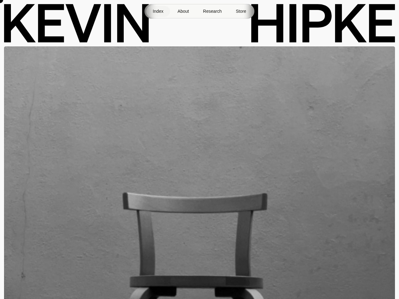
Kevin Hipke’s portfolio commands attention through assertive scale and monastic discipline. The confrontation of oversized Söhne type with quiet, architectural monochrome photography establishes an immediate sense of authorial confidence. The pill navigation floats neatly in the typographic gutter, preserving white space while keeping utilities within effortless reach. Beneath the hero, the layout maintains a strict Swiss-Dutch grid that treats client casework with museum-grade precision. While visually compelling and refined in its minimalism, the site is technically hindered by a sluggish initial server response time (exceeding three seconds) and an absence of heading landmarks beneath the primary title. Nonetheless, it stands as a masterclass in understated editorial direction.
What the jury loved
- Commanding typographic scale with impeccable kerning and spatial tension.
- Restrained monochromatic photography that complements the architectural layout.
- Clear, unobtrusive pill navigation that floats naturally within the header.
For the winner
Wear the award.
Add the official badge to your site, case study or press page. It links back to this review — and readers who click through can see exactly why you won.
About the badges →Winner's badge
Add the badge to your site
Copy a snippet and paste it anywhere — it links back to your review.
<a href="https://websitedesignawards.com/site/kevin-hipke" target="_blank" rel="noopener">
  <img src="https://websitedesignawards.com/api/public/badge/e7f73a02-69e4-4309-aaec-406536d13d17/svg?variant=dark" alt="Kevin Hipke — Winner, Website Design Awards" width="240" height="88" loading="lazy" />
</a>[](https://websitedesignawards.com/site/kevin-hipke)