lovely&friendly
lovelyfriendly.com · Portfolio
The jury's review
Jury review of lovely&friendly
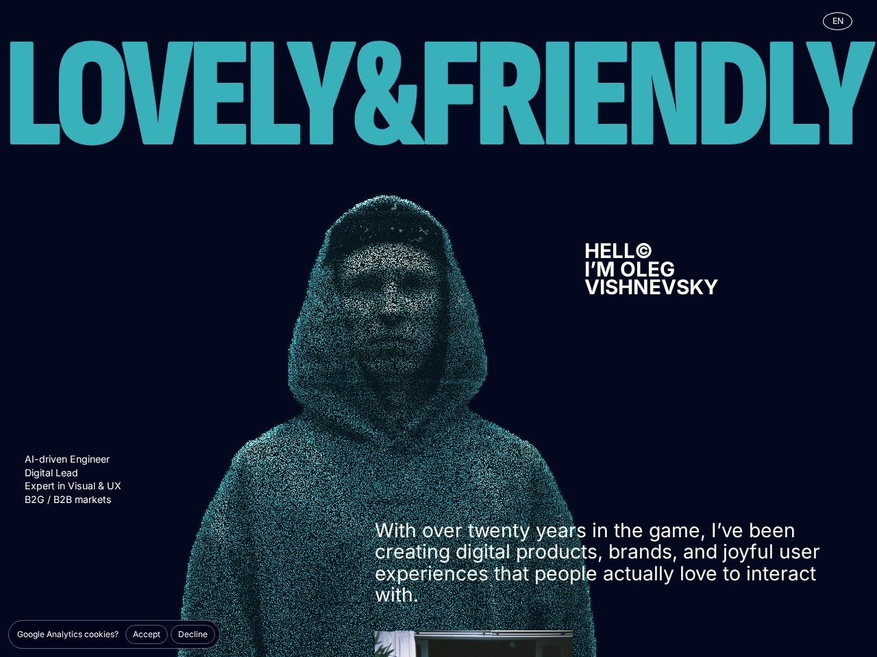
A dark, cyber-aesthetic portfolio featuring a point-cloud hooded avatar, monumental display type, and concise positioning.
Lovely & Friendly, the portfolio of Oleg Vishnevsky, immediately signals technical ambition through its cyan point-cloud portrait set against deep navy. The bold typography header frames the top firmly, but the text layout across the hero feels fragmented, with small clusters of sans-serif text floating in four disconnected quadrants without a dominant visual path. The technical execution shows solid fundamentals with declared reduced-motion rules and semantic landmarking, but the actual content presence is thin, notably relying on a 'coming soon' for core case studies. As an introductory billboard it creates mood, yet it requires more disciplined typographic hierarchy and substantiating project work.
What the jury loved
- Striking teal point-cloud portrait that sets an immediate tech-forward visual tone.
- Restrained, atmospheric colour palette between deep obsidian navy and electric cyan.
- Clean technical implementation with reduced motion support and semantic landmarks.
For the winner
Wear the award.
Add the official badge to your site, case study or press page. It links back to this review — and readers who click through can see exactly why you won.
About the badges →Winner's badge
Add the badge to your site
Copy a snippet and paste it anywhere — it links back to your review.
<a href="https://websitedesignawards.com/site/lovely-friendly" target="_blank" rel="noopener">
  <img src="https://websitedesignawards.com/api/public/badge/46c6a7f0-272b-44b5-b9cc-b825250d855b/svg?variant=dark" alt="lovely&friendly — Honorable Mention, Website Design Awards" width="240" height="88" loading="lazy" />
</a>[](https://websitedesignawards.com/site/lovely-friendly)