mappy
meetmappy.com · Product
The jury's review
Jury review of mappy
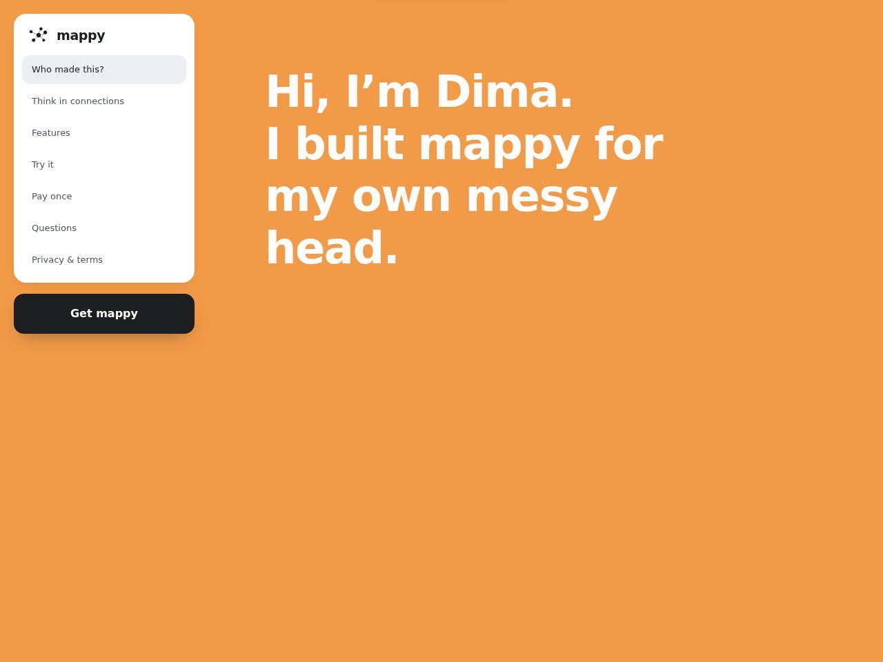
An intimate, presentation-style software landing page that pairs bold typography and shifting background fields with a fixed pill navigation.
Mappy breaks away from predictable SaaS landing page tropes by framing its product pitch as an intimate personal presentation. Grounded by a persistent floating card for navigation and primary action, the viewport allows massive typography to set an empathetic, candid tone. The restraint in visual decoration allows the creator's narrative to take center stage, transitioning smoothly between full-bleed color panels. While an immediate glance at the app interface above the fold is missing, the deliberate pacing, clean semantics, and crisp layout deliver a focused and refreshing indie software showcase.
What the jury loved
- Charismatic, presentation-like narrative structure that feels refreshingly personal.
- Persistent floating card navigation that offers clear section-jumping and frictionless conversion cues.
- Strong typographic hierarchy with bold weight and immaculate whitespace balance.
For the winner
Wear the award.
Add the official badge to your site, case study or press page. It links back to this review — and readers who click through can see exactly why you won.
About the badges →Winner's badge
Add the badge to your site
Copy a snippet and paste it anywhere — it links back to your review.
<a href="https://websitedesignawards.com/site/mappy" target="_blank" rel="noopener">
  <img src="https://websitedesignawards.com/api/public/badge/274c8e5a-726f-43a2-8e7d-ff8d0c010878/svg?variant=dark" alt="mappy — Site of the Day, Website Design Awards" width="240" height="88" loading="lazy" />
</a>[](https://websitedesignawards.com/site/mappy)