RoamDial
roamdial.com · Experimental
The jury's review
Jury review of RoamDial
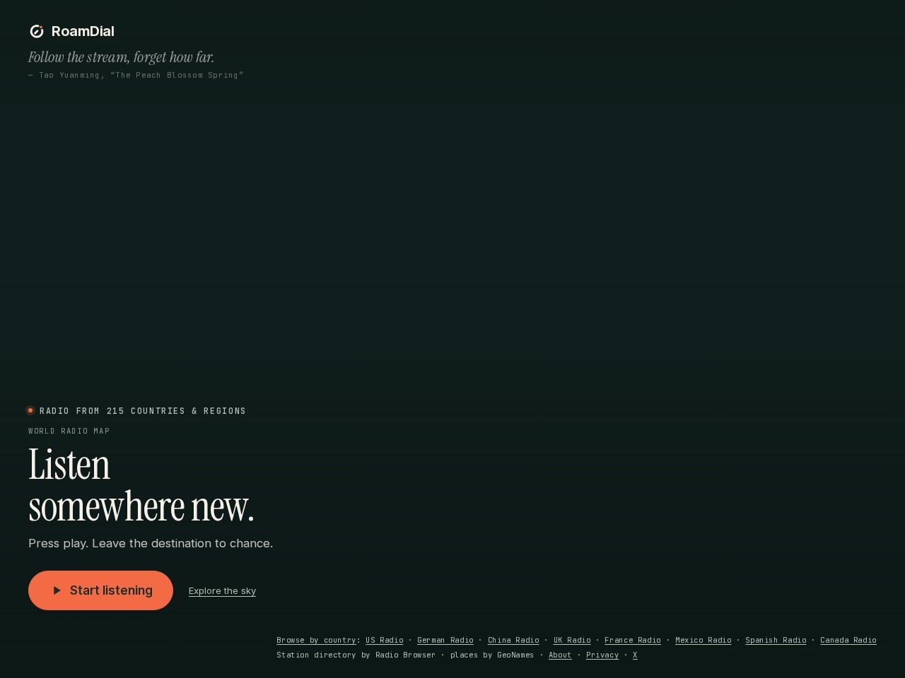
A minimalist portal into global broadcast streams that pairs atmospheric dark styling with serendipitous audio exploration.
RoamDial channels the spirit of Radio Garden with a quieter, poetic sensibility. Its opening impression relies on restrained restraint: generous negative space, refined serif typography, and a prominent coral CTA that invites immediate serendipity. While the empty expanse suggests an interactive canvas or globe that activates upon engagement, the static arrival feels somewhat hollow without visual hinting or placeholder atmosphere. Structurally, the HTML could benefit from landmark regions and reduced-motion consideration. Nonetheless, the poetic framing and focused utility create an enticing, uncluttered portal for auditory travel.
What the jury loved
- Restrained, moody colour palette paired with punchy coral call-to-action styling
- Evocative editorial typography combining literary quotes with refined serif headings
- Single-minded interaction model focused immediately on exploration and listening
For the winner
Wear the award.
Add the official badge to your site, case study or press page. It links back to this review — and readers who click through can see exactly why you won.
About the badges →Winner's badge
Add the badge to your site
Copy a snippet and paste it anywhere — it links back to your review.
<a href="https://websitedesignawards.com/site/roamdial" target="_blank" rel="noopener">
  <img src="https://websitedesignawards.com/api/public/badge/1a39692f-4094-4560-b3ea-3afa86cefb03/svg?variant=dark" alt="RoamDial — Honorable Mention, Website Design Awards" width="240" height="88" loading="lazy" />
</a>[](https://websitedesignawards.com/site/roamdial)