Soma
soma-health.co · Product
The jury's review
Jury review of Soma
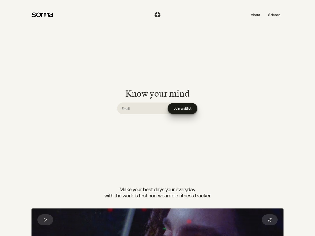
A serene, editorial product landing page for a voice-based mental fitness tracker, pairing calm ivory backgrounds with restrained typography.
Soma adopts an understated, meditative aesthetic to position itself as a thoughtful mental wellness tool rather than an aggressive tech utility. The combination of warm ivory, disciplined typography, and expansive negative space creates immediate atmospheric calm. The transition from the delicate serif hero to the richer content below is handled with restraint. While the visual poise is undeniable, the extreme minimalism creates a slight friction: the low-contrast waitlist input relies heavily on placeholders without explicit label associations, and the vast vertical spacing demands significant scrolling before the product's actual value proposition and interface are revealed. Still, it is a polished and self-assured piece of product art direction.
What the jury loved
- Immaculate typographic balance combining a quiet serif with crisp sans-serif details.
- Intentional, generous use of whitespace that reinforces the product's mindfulness proposition.
- Clean semantic landmark structure with accessible navigation and proper heading hierarchy.
For the winner
Wear the award.
Add the official badge to your site, case study or press page. It links back to this review — and readers who click through can see exactly why you won.
About the badges →Winner's badge
Add the badge to your site
Copy a snippet and paste it anywhere — it links back to your review.
<a href="https://websitedesignawards.com/site/soma" target="_blank" rel="noopener">
  <img src="https://websitedesignawards.com/api/public/badge/0314dfe4-d8cf-4429-96fd-dfcf4d05a8bc/svg?variant=dark" alt="Soma — Site of the Day, Website Design Awards" width="240" height="88" loading="lazy" />
</a>[](https://websitedesignawards.com/site/soma)