SOWA
sowa.fans · Cultural
The jury's review
Jury review of SOWA
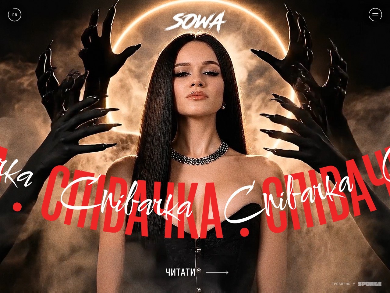
An atmospheric artist showcase blending gothic photo manipulation, kinetic typography, and smooth GSAP-driven navigation.
SOWA's official website embraces a bold, cinematic visual identity tuned to the artist's gothic-pop persona. Built with GSAP and Lenis, the experience prioritizes theatrical art direction, utilizing dark, moody photo composite techniques alongside layered, aggressive typography. The collision of ultra-condensed Cyrillic block type with fluid script creates immediate visual intrigue, even if it tests legibility in motion. Technically, the front-end lacks basic structural semantics—omitting an h1 and key ARIA landmarks—and bypasses reduced-motion preferences. Nevertheless, as a promotional digital experience for a contemporary music artist, it delivers an impactful, stylized entrance that clearly commands attention.
What the jury loved
- Striking art direction and photo composite work that establishes an immediate mood
- Dynamic typographic contrast combining condensed display type with expressive script
- Smooth interaction and transitions enabled by GSAP and Lenis
For the winner
Wear the award.
Add the official badge to your site, case study or press page. It links back to this review — and readers who click through can see exactly why you won.
About the badges →Winner's badge
Add the badge to your site
Copy a snippet and paste it anywhere — it links back to your review.
<a href="https://websitedesignawards.com/site/sowa" target="_blank" rel="noopener">
  <img src="https://websitedesignawards.com/api/public/badge/6ff1d231-c2a1-4a17-bd3f-be234ab23264/svg?variant=dark" alt="SOWA — Honorable Mention, Website Design Awards" width="240" height="88" loading="lazy" />
</a>[](https://websitedesignawards.com/site/sowa)