Two Halves
twohalves.studio · Agency
The jury's review
Jury review of Two Halves
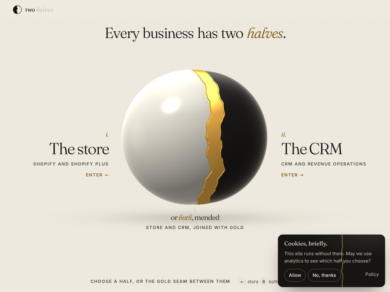
A bifurcated studio landing page exploring the dual nature of e-commerce storefronts and back-office revenue operations with kintsugi-inspired metaphors.
Two Halves frames its Shopify and RevOps consultancy around an intriguing conceptual fork: presenting two halves of commerce and the gold seam that binds them. While the visual rendering cannot be judged directly due to the lack of a screenshot, the underlying structure shows careful attention to usability basics, including proper landmarks, keyboard navigation cues, and declared motion sensitivities. The high-concept binary interaction model creates immediate narrative intrigue, though relying heavily on an upfront gateway selection can occasionally deter visitors seeking quick credentials and substantive portfolio evidence.
What the jury loved
- Clever conceptual positioning that directly mirrors the studio's dual-service offering.
- Sound structural markup including landmarks, skip navigation, and reduced-motion consideration.
For the winner
Wear the award.
Add the official badge to your site, case study or press page. It links back to this review — and readers who click through can see exactly why you won.
About the badges →Winner's badge
Add the badge to your site
Copy a snippet and paste it anywhere — it links back to your review.
<a href="https://websitedesignawards.com/site/two-halves" target="_blank" rel="noopener">
  <img src="https://websitedesignawards.com/api/public/badge/fa876a80-c80f-4609-9e2e-50a7b6311c18/svg?variant=dark" alt="Two Halves — Honorable Mention, Website Design Awards" width="240" height="88" loading="lazy" />
</a>[](https://websitedesignawards.com/site/two-halves)