Olisticplace
olisticplace.gr · Commerce
The jury's review
Jury review of Olisticplace
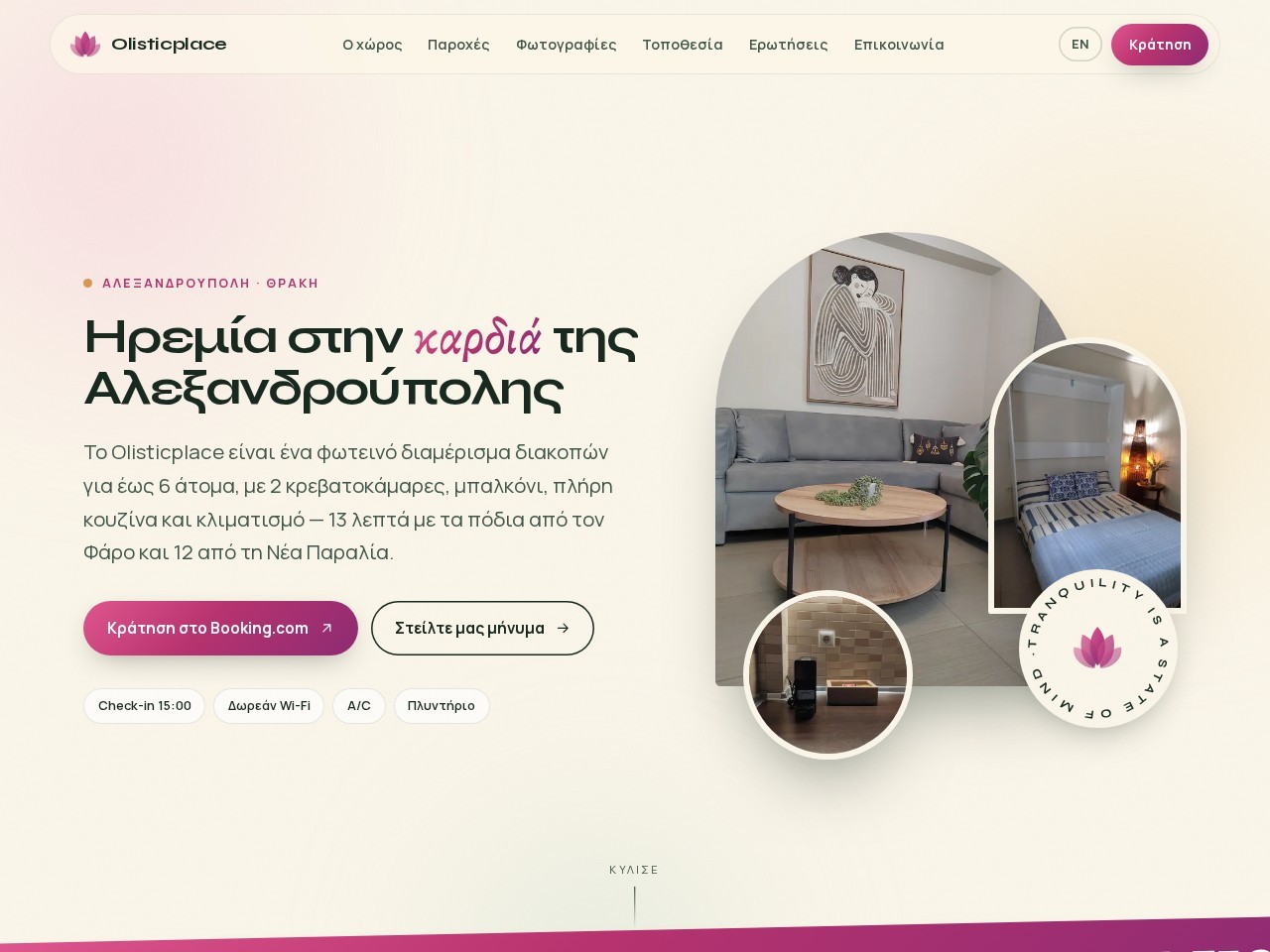
A gentle, warm landing page for an Alexandroupoli holiday apartment, pairing soft pastel tones with pill-shaped photographic collages.
Olisticplace presents a warm, welcoming presence for a Greek vacation rental. The art direction leans into calming pastel shades of cream and berry, matching the brand's focus on tranquil accommodation. The typography handles Greek glyphs gracefully, and the layout breaks free from standard rental grids by adopting pill and arch masks for its imagery. While visually pleasant and technically clean—boasting robust semantic markup, labelled elements, and comprehensive alt attributes—the photography itself feels somewhat casual compared to the polished UI shell. It stands as a very capable, tidy commercial landing page, though structurally conventional.
What the jury loved
- Impeccable semantic structure with full landmarking and 100% labelled interactive elements.
- Cohesive, calming colour palette that reinforces the brand's 'tranquility' narrative.
- Clear typographic hierarchy and legible Greek typesetting.
For the winner
Wear the award.
Add the official badge to your site, case study or press page. It links back to this review — and readers who click through can see exactly why you won.
About the badges →Winner's badge
Add the badge to your site
Copy a snippet and paste it anywhere — it links back to your review.
<a href="https://websitedesignawards.com/site/olisticplace" target="_blank" rel="noopener">
  <img src="https://websitedesignawards.com/api/public/badge/817179ee-0756-4023-9ed5-251a8f139695/svg?variant=dark" alt="Olisticplace — Honorable Mention, Website Design Awards" width="240" height="88" loading="lazy" />
</a>[](https://websitedesignawards.com/site/olisticplace)